Memes
Seven Misleading Memes of Political Analysis
Applying basic statistics to understand political polls and voting behavior
Posted August 15, 2016
In political polling, when is a “dead heat” not a dead heat? When does a small percentage in the polls mean a large difference in the final results? What mistakes do journalists consistently make when trying to communicate public opinion polls?
Most political commentators are not trained in psychology or statistics, so they are prone to perpetuate misinterpretations of polling results and voting behavior. In the next 80 days, here is what we should watch out for.
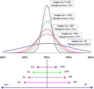
1) The most frequent and frustrating mistake of political commentators is the labeling of any poll as a “dead heat” if the difference between candidates is within the margin of error (MoE).

In fact, a dead heat is suggested only when the candidates are actually tied. If Candidate H is ahead of Candidate T by 52% to 48% in a poll with a MoE of 4%, that means the poll’s best estimate is that Candidate H leads by 4 percentage points. It’s that clear. And it is not a dead heat. Indeed, it’s just as likely that Candidate H leads Candidate T by 8 percentage points as it is that the candidates are tied.
Measurement error should be noted but not misinterpreted.
2) Small differences in the polls are often dismissed.

A small and consistent difference in the polls can lead to large differences in the voting booth. If Candidate H leads Candidate T by 3 percentage points over a period of two months, that 3 percent is meaningful. In a two-way presidential election, that percentage would lead to a convincing win for Candidate H. Extrapolating from the turnout in the 2012 presidential election, a 3% lead would translate into a difference of 4 million votes.
3) Proportions are often presented as categorical and absolute – when they are actually marginal and relative.
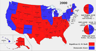
The most dramatic example of this mistake is the depiction of “red states” and “blue states.” Although obvious, this mistake warrants emphasis. If 54% of the voters in a state vote Republican, then that means 46% did not. The same can be said of demographic information. If Candidate T leads among voters without a college education, that doesn’t mean all such people support Candidate T. In general, human beings have a tendency to think categorically, which only emphasizes the need for guarding against conceptualizing a majority as the entire group.
4) When presented out of context, statistics mislead.

In the latest presidential primary, for example, saying that each winning candidate received support from less than 7% of the electorate is accurate, but out of context. In a contested primary, the winning candidate usually receives less than 7% of the total electorate. Such a result is typical – not shocking or even newsworthy. Total turnout in the primaries and caucuses for a major party is typically less than 13% of the electorate. Silently implying a comparison condition of 100% turnout is unrealistic. Even in a general presidential election, turnout over the past half century reliably stays under 60%. Twenty years ago, it was under 50%. In 2012, President Obama was elected convincingly with votes from 27% of the electorate.
5) A particular level of aggregation can lead to faulty understanding.
States are important in elections because they form the basis of the Electoral College, but they are usually not appropriate groupings for understanding American politics. Again, we do not have red states and blue states. Each state has a mix of Democrats, Republicans, and Independents, with a majority of Democrats in urban areas, a majority of Republicans in rural areas, and a mix in the suburbs. In terms of understanding different voting groups, the categories of urban, rural, and suburban are more informative than state boundaries.
6) Ignoring data can lead to statements of false equivalence.
For example, political commentators like to talk about the favorability and unfavorability of a candidate, subtracting unfavorable ratings from favorable, which then gives the net unfavorability rating. If Candidate H has a net unfavorability rating of -11, that is not good. But if Candidate T has a net unfavorability rating of -28, then that is considerably worse. To dismiss the difference by saying that both candidates have high unfavorability ratings is to mislead by throwing away data.
7) Maps represent land mass and not people.

Although most commentators are aware of this in 2016, it is still visually overwhelming to represent the two major parties in this country with two different colors, red and blue. Mountains, prairies, and fields of corn and wheat do not vote. Showing a map with these two colors superimposed on the different states can mislead viewers about the dominance of one party over another.
These are not partisan issues. They are mistakes of numeracy and data representation that basic statistical reasoning can correct.


