Intelligence
4 Tips for Presenting Quantitative Information Effectively
When reporting numbers, psychologists should aim for accuracy & impact
Posted March 27, 2016
Virtually every psychologist presents quantitative information at one time or another. For many of us, it’s a frequent occurrence. We may want to report the results of a new study in a seminar, or describe someone else’s findings to make a point. Whatever the reason, presenting quantitative information effectively is challenging. And the difficulty is compounded when the audience is technically savvy and quantitatively-minded. Such audiences tend to be skeptical, detail-oriented, and concerned with statistical details. Challenges also arise when the audience is mixed, and comprised of some people who focus on the nitty-gritty and others who couldn’t care less.
Under such circumstances, how to present quantitative information effectively? Here are four tips.
Tip #1: Practice Statistical Hygiene.
Unhygienic statistical presentation won’t get us far with a technically-savvy audience. Instead, our credibility and our content’s credibility will both take a hit.
What do I mean by statistical hygiene? In this context, I consider it as presenting information in a way that is technically accurate, aesthetically appealing, and ethically above board, all at the same time. Here are two examples.

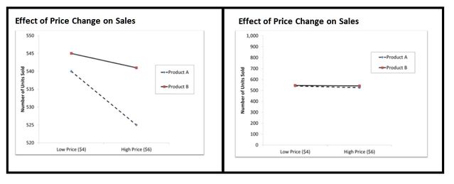
Consider a national grocer that conducted a month-long experiment to understand the effects of cutting prices on sales of two detergent brands. At some randomly chosen store locations, the grocer sold detergents A & B on sale at $4 per box for a month; at other locations, the price was $6 per box. Did these price cuts increase sales? In the figure above, the panel on the left shows the results of this experiment by retaining a very small section of the y-axis, from 520 to 550 units. Under this dubious presentation format, the results look pretty impressive. With the seeming drastic drop-off, this visual suggests that Product A sales really suffered from the price increase, while sales of Product B remained relatively unaffected. But this is clearly misleading. In reality, as the right panel shows, when the entire y-axis is shown (including 0), the actual decrease in sales is hardly worth mentioning for either brand.

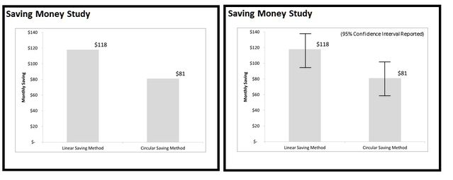
Or take another example. In this case, the hypothetical experiment is about the impact of using different saving methods – linear or circular – on how much money people save each month. The left panel above shows the results in a way that is commonly reported in many psychology journals. What are we to conclude from this figure? Is $81 under the circular saving method statistically distinguishable from the $118 saved with the linear method? We simply cannot answer this question, resulting in an instance of unhygienic statistical presentation. The panel on the right fixes this problem by providing the 95% confidence intervals (and showing that the two means actually overlap).
Tip #2: Define constructs precisely.
When communicating quantitative information, it is crucial to clearly define the concepts under discussion precisely. It is surprising how often this basic detail is overlooked by the presenter. Let’s take the example of “market share” that is widely used to evaluate and communicate performance of businesses. (There are weaknesses with this concept, but that is a topic for another day. Here I am only concerned with the problem associated with not defining market share precisely).
Now market share is simply a measure of the firm’s share of sales of the market where its products are concerned. But its precise definition requires care. First, the market must be carefully defined, by geography (the entire world, United States, greater Houston), by specific products (all 4-wheel vehicles, SUVs, sedans, ultra-luxury cars) and by time (year, month, week). What is more, a critical aspect of market share’s definition is whether it is based on units sold or revenues earned. Within a particular market, when all car sales are considered, a luxury car brand like Lexus or Mercedes will usually have a smaller unit market share (because it sells fewer cars) and a larger revenue market share (it sells more expensive cars) at the same time. When presenting such information, unless type of market share is clearly specified, the audience receives incomplete information.
The need for precise definition applies to numerous other concepts including psychological terms like “IQ” or “Emotional Intelligence”, engineering terms like “tolerance” or “crude oil reserves”, and financial terms like “market capitalization” or “relevant costs”. In each and every case, a precise definition has to come first before any discussion of actual values.
Tip #3: Provide contextual details.
Quantitative information in psychological (and other) contexts is presented for a specific purpose. For instance, an author may want to report the current national homicide rate, saying that: “In 2013, the estimated number of murders in the United States was 14,196, a rate of approximately 4.5 murders per 100,000 people.”
What do these values mean? Without proper context, there isn’t much insight.
But now, when the author also reports that: “In 2013, 32,719 people died in automobile accidents, a rate of 10.3 automobile deaths per 100,000 people.” Suddenly, both sets of numbers provide more meaningful information.
Or, if the author wanted to say something different, she could add that: “The murder rate fell 5.1 percent in 2013 when compared to the 2012 rate” or that: “The murder rate in each of United Kingdom, Ireland, France, and Australia is 1.1 murders per 100,000 people.”
My main point: Unless the appropriate contextual information is explicitly provided, the presented numbers provide little insight. Now let’s take this idea one step further.
Tip #4: Be comparative, not absolute.
Over the last couple of decades, one thing that psychologists have conclusively established is that individuals process information comparatively, not absolutely. Whether they are classifying or evaluating, people consider new information in the light of other information that they already know or that they encounter at the moment. To give one example, when confronted with the price of a product, consumers ask themselves if this is a good or a bad price based on their knowledge about prices, and based on whether there is a sale sign.
What this means is that when presenting quantitative information, we must provide a carefully chosen comparative benchmark for our audience to use.

Let’s consider the example of a car dealership which reports that its customers had a satisfaction score of 73/100 last month. To allow readers to evaluate whether this is a good or bad thing, the dealership may be well-advised to report something like “our average satisfaction scores over the past year have been 66” or “our competitor’s customers only reported a score of 68”. Such values not only provide details of the context, but they specifically provide benchmarks to the audience to compare against. If the dealership omits providing a benchmark, the audience will use a benchmark anyway. And it might be one over which the dealer has no control, or one that may be wrong, misleading, or ambiguous. It will subtract from, rather than add value to the presented quantitative information.
My core point: Always present key quantitative information in comparative terms, with a carefully chosen benchmark as the basis for comparison.
This blog post is based on a talk that I gave to the Houston Chapter of the International Association of Business Communicators in March 2016.
I teach marketing and pricing to MBA students at Rice University. You can find more information about me on my website or follow me on LinkedIn, Facebook, or Twitter @ud.


