
Rorschach Test
What Do We See in the Electoral Map?
As with an inkblot, perceptions of American polarization vary
Posted November 9, 2012
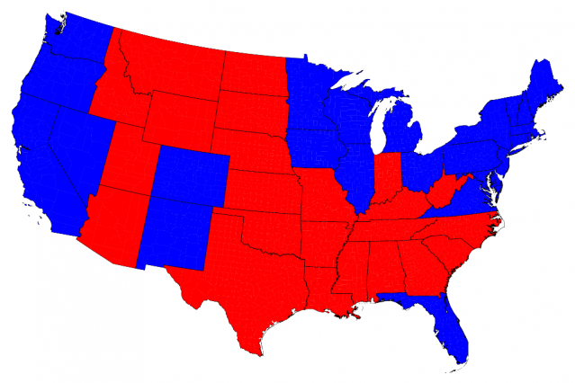
This blog typically makes arguments about how people think, reason, and feel using words. But today, a point is going to be made with two images. Both are maps of Presidential voting in the 2012 election. The first will be familiar, showing a country divided between red states across the South and West and blue states hugging the Northeast and Western coasts.
The second map shows the same data, broken down at the county level with counties shown according to their population rather than their geographical area, and continuous measures of vote share rather than which candidate won the county.
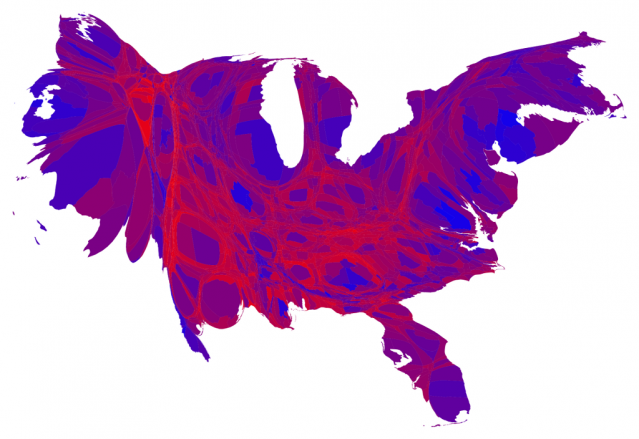
The two images seem to show two different nations: the first sharply divided and geographically polarized and the second a chaotic mix of sparsely populated “purple” counties. These areas voted approximately equally for both candidates whereas several large urban areas (e.g., New York City, San Francisco, Chicago, etc.) that voted heavily for Barack Obama and a smaller number of “red” counties in the West and South tipped toward Mitt Romney.
Some psychoanalysts believe that Rorschach tests tell us about what is going on in our minds. These two maps says a lot about American polarization, but what you see in them says a lot about how you perceive that polarization. The familiarity of the first map suggests we believe polarization to be rampant and geographically based. But is that the same message to take away from the (arguably more accurate) second map?
Image sources: Mark Newman, University of Michigan http://www-personal.umich.edu/~mejn/election/2012/

